Go together. Grow together.
As a strategist and designer, I had the opportunity to work on a project for QMAGO, a real estate development company that stands for a holistic investment process and a comprehensive conception of real estate projects. QMAGO sees itself as a platform for effective development processes that promote growth financially, ecologically, and socially, based on actual needs and specific UN targets.
Together with my creative partner Nicole Berti and the leading team at QMAGO, we developed the brand name QMAGO, the visual brand identity, and the content for the communication material. Our goal was to create a brand that would reflect the company's commitment to effective, solution-oriented cooperation and sustainable growth.
Throughout the project, we worked closely with the QMAGO team to ensure that the brand identity and communication material were aligned with the company's values and mission. We developed a strong visual identity that included a custom logo, color palette, typography, and graphic elements.
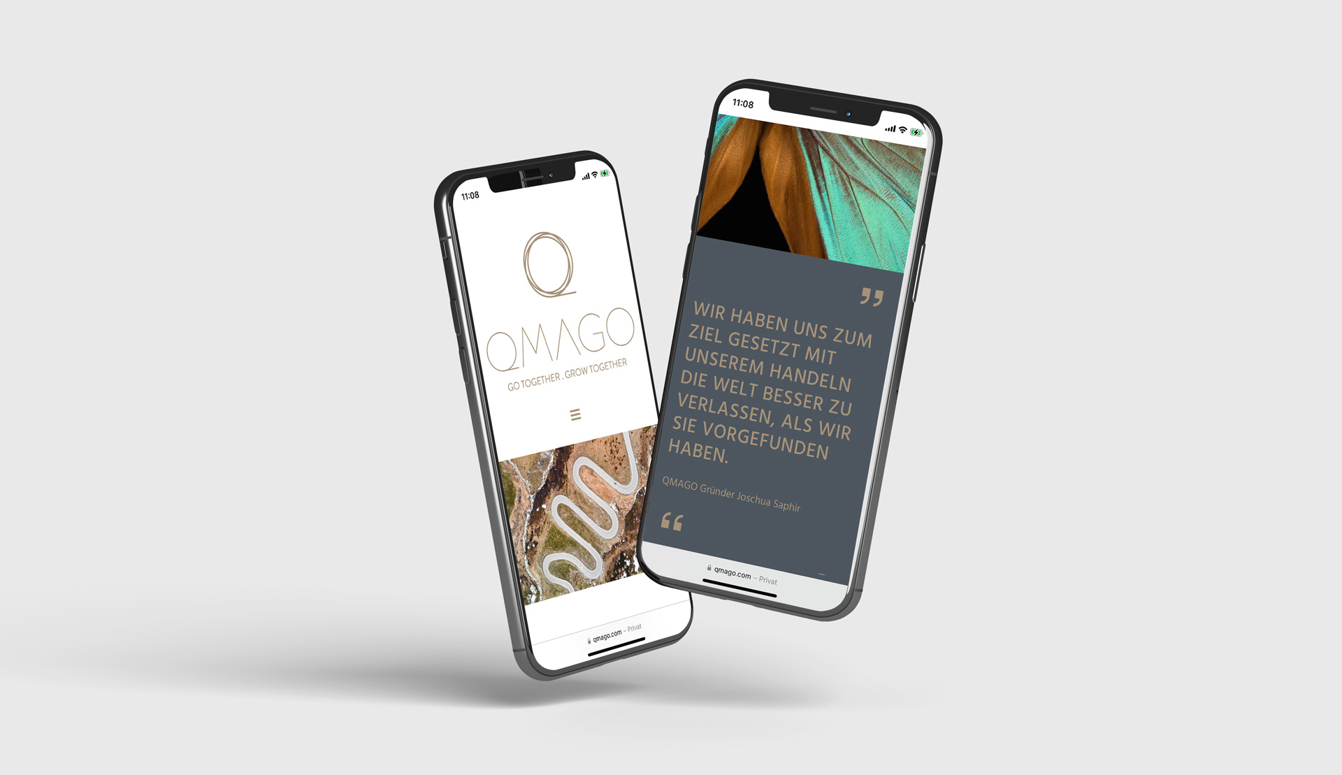
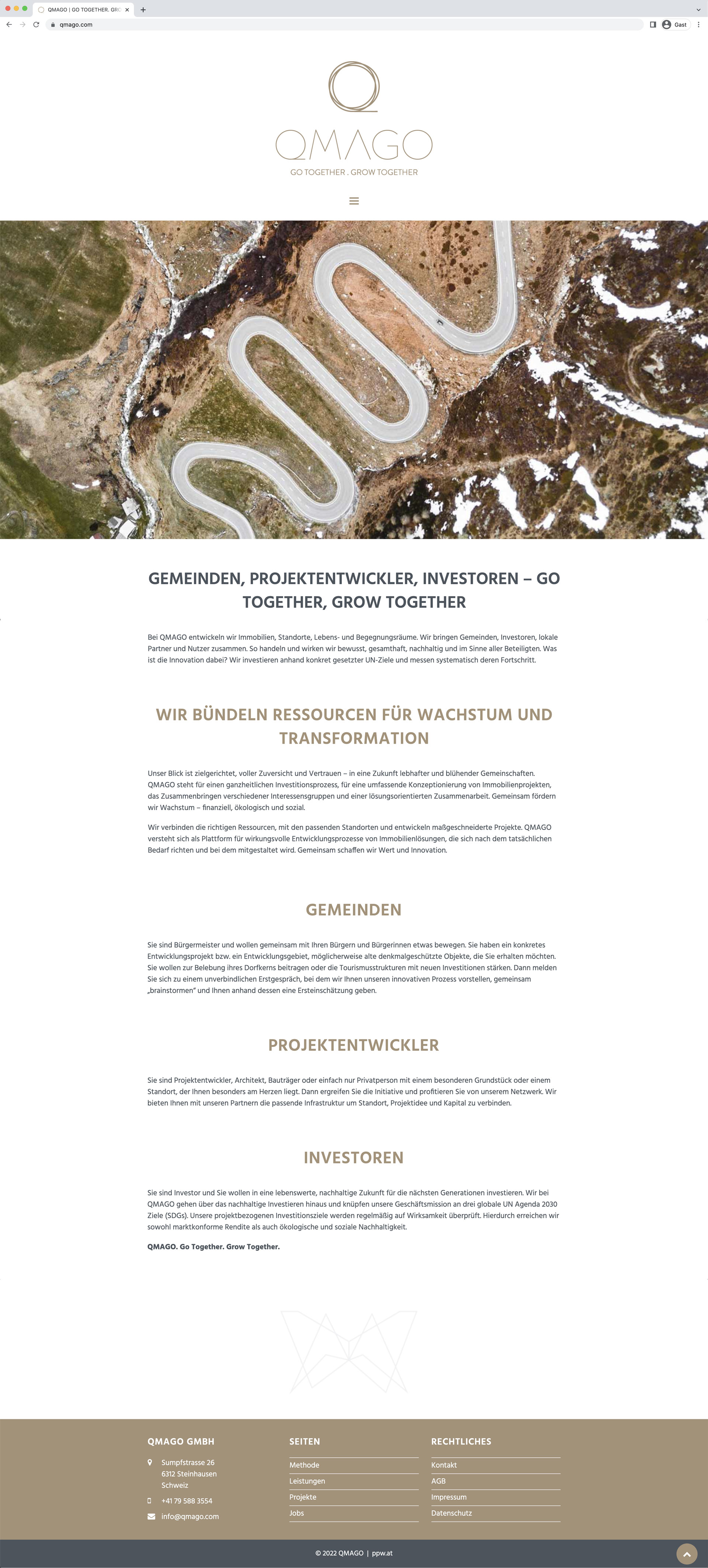
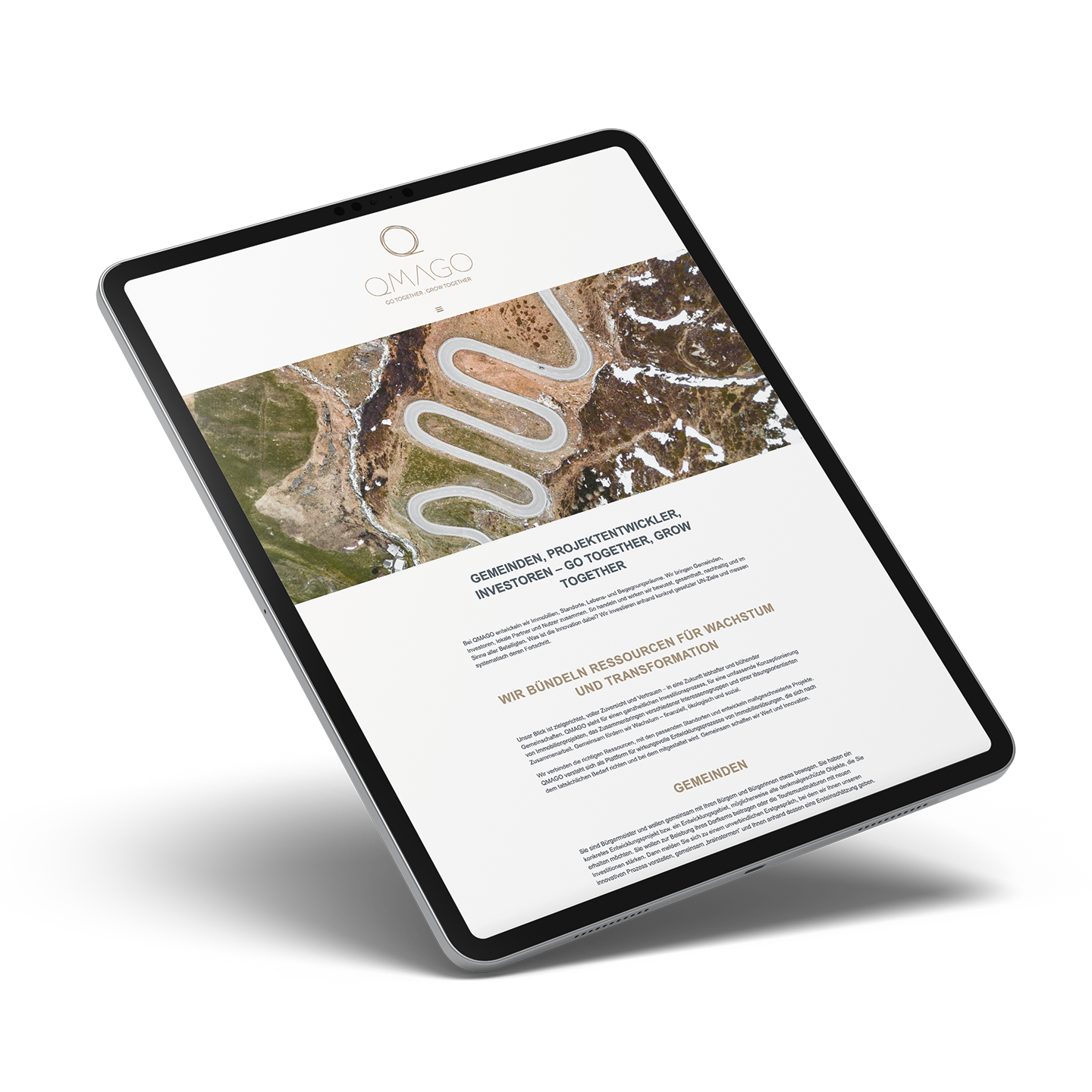
We also created a range of communication materials, including a website design, and marketing collateral. These materials were designed to communicate QMAGO's unique approach to real estate development and highlight the company's commitment to sustainable growth.
Overall, working on the QMAGO project was a rewarding experience. It allowed me to combine my strategic and design skills to create a strong brand identity and effective communication materials for a company that is committed to making a positive impact on the world. I'm proud to have been a part of this project and to add it to my portfolio.
ROLE
Creative Director, Art Director, UX/UI Design
CLIENT
QMAGO GMBH
MY CONTRIBUTION
Creative strategy, workshop moderation, naming, branding, visual identity, and conception for print and digital assets together with Nicole Berti; Design lead and execution on the web design
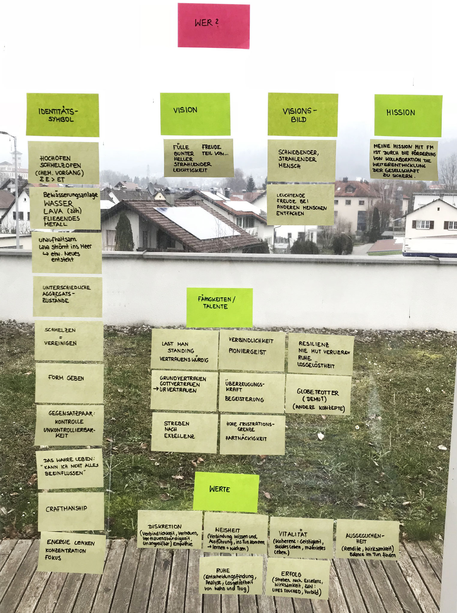
Visual Code: Building a Strong Foundation for the Brand Identity
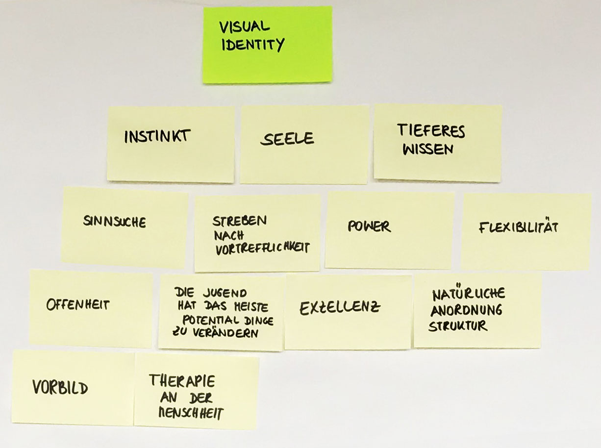
Workshop session 1
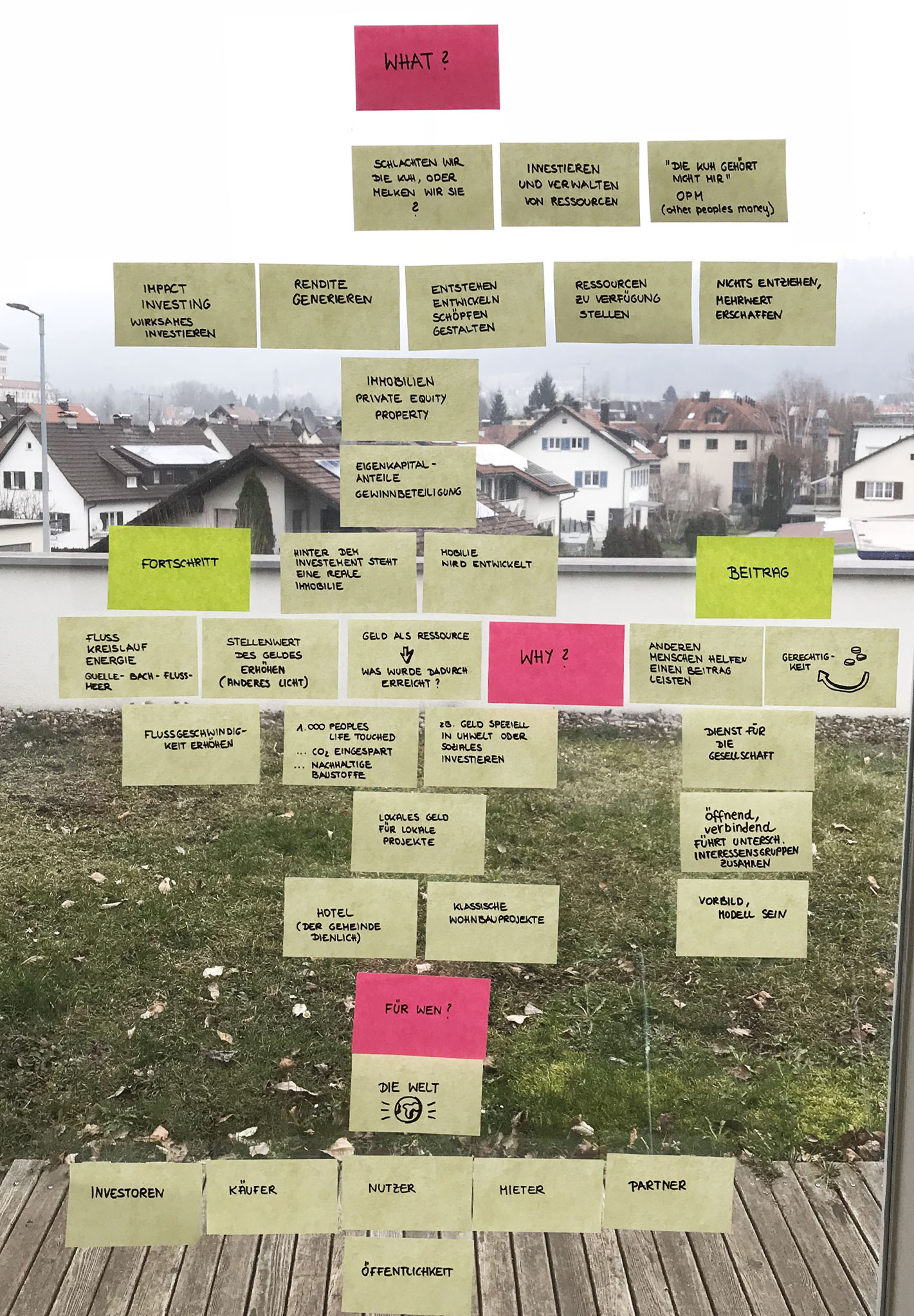
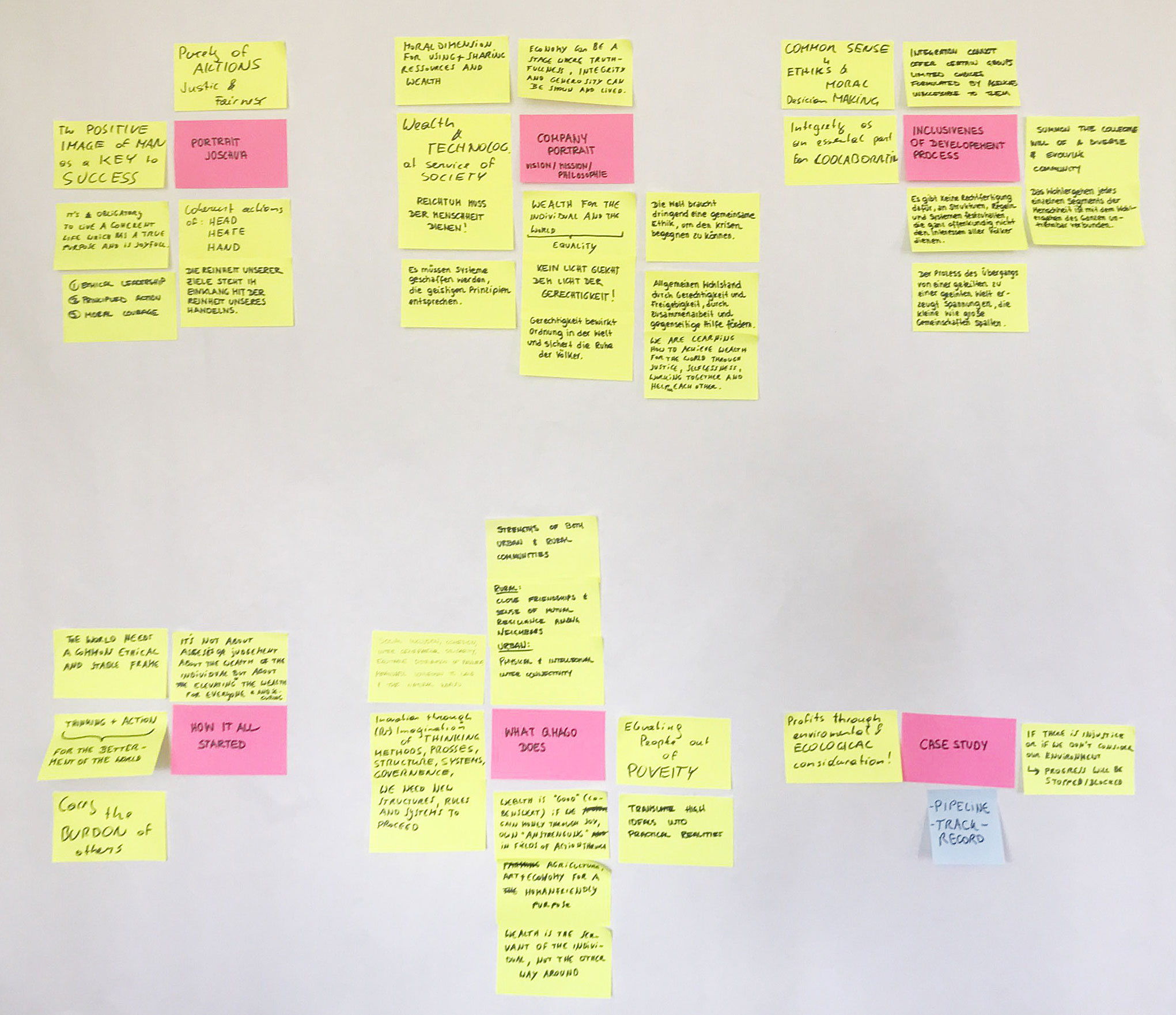
We developed the visual code based on the mission statement. The vision, mission, and values have been the foundation for the colors, shapes, and elements. They lay the groundwork for the corporate identity. Together with the client, we sparked ideas and defined how and in what form to convey the company's message to the world.
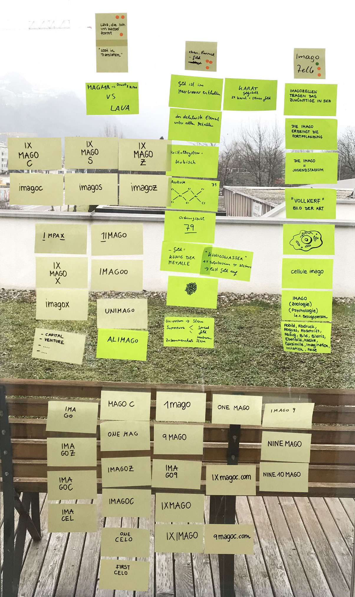
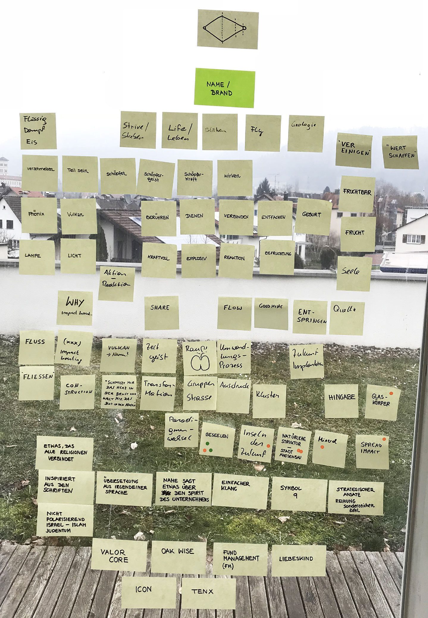
Crafting a Strong and Memorable Image
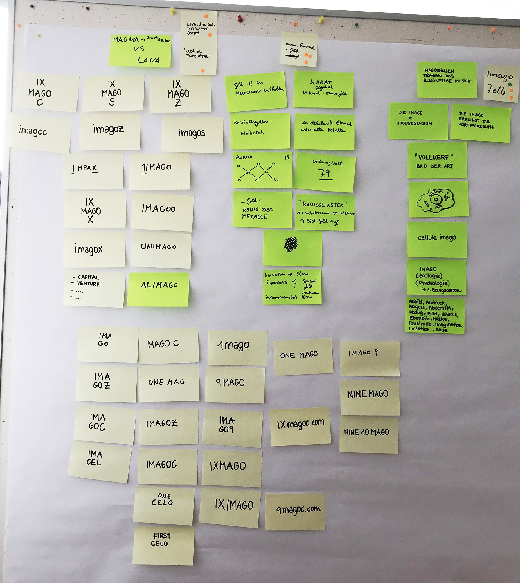
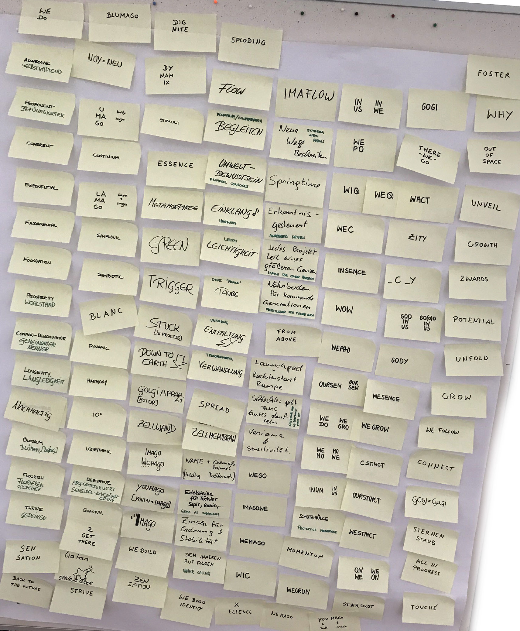
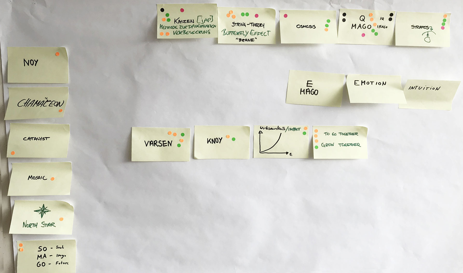
Workshop session 2
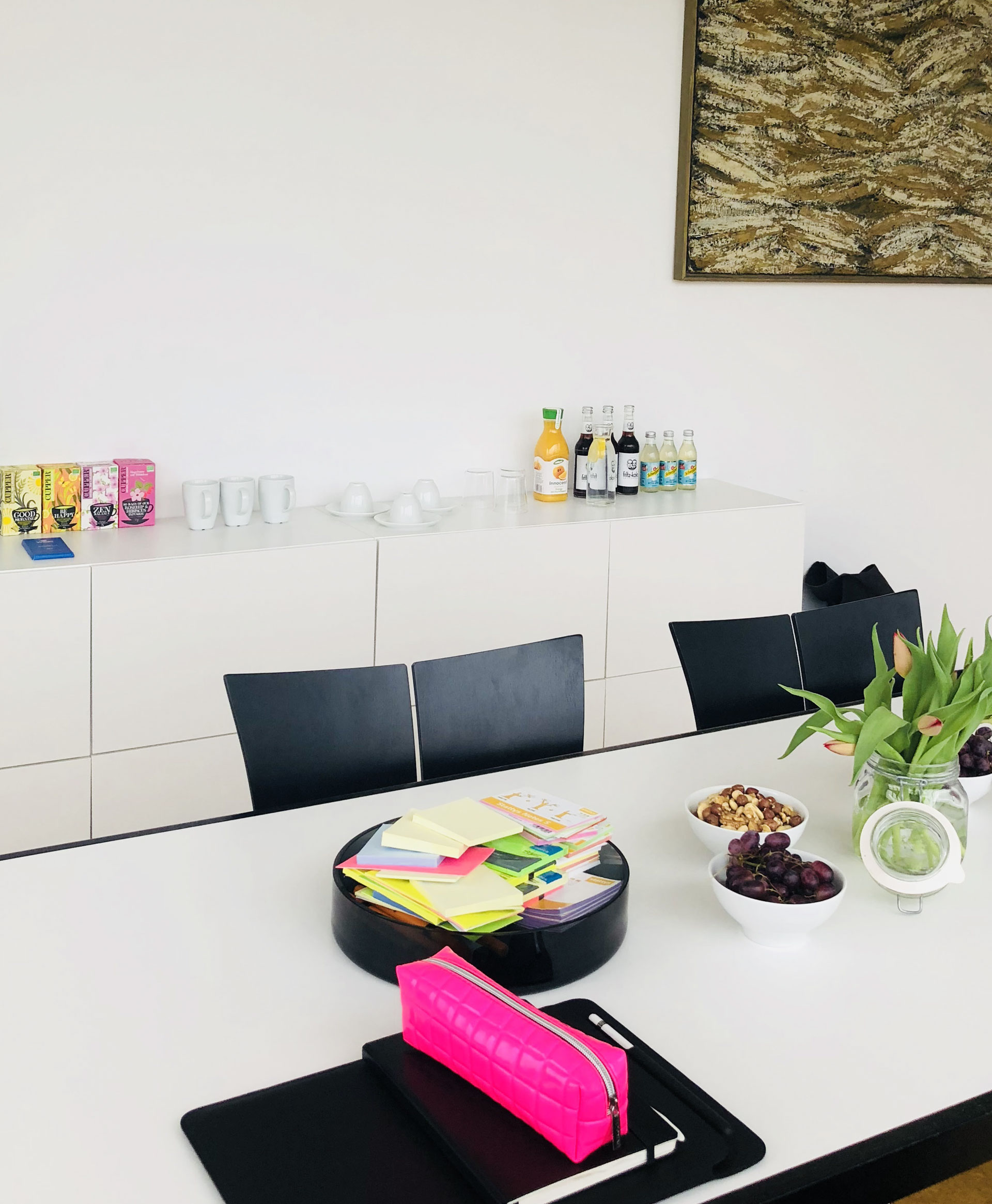
Based on the corporate mission statement and insights from the first workshop, we developed the brand name and key visual with the company's team in the second part of the workshop.
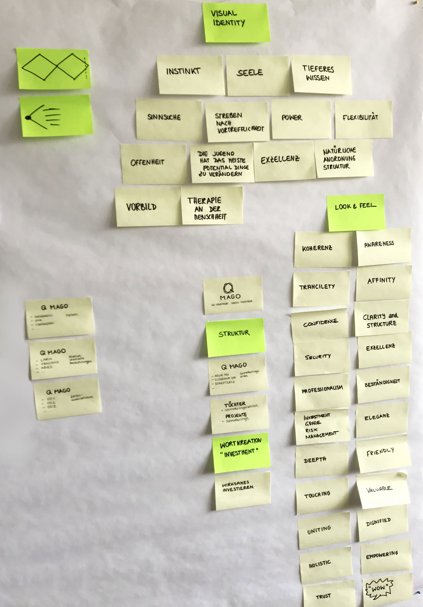

Branding

The website
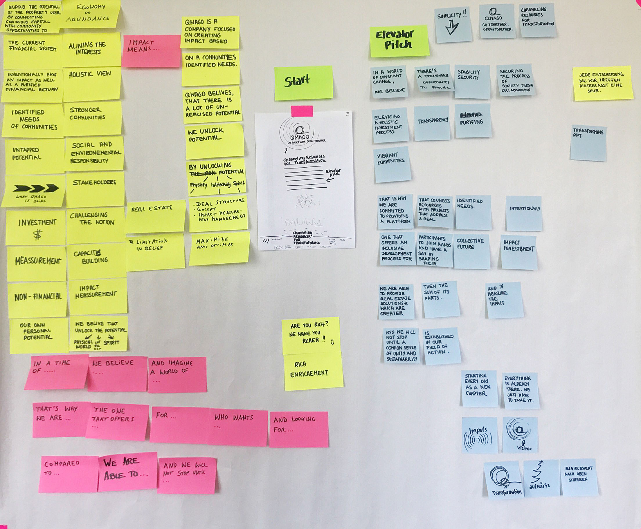
Workshop session 3
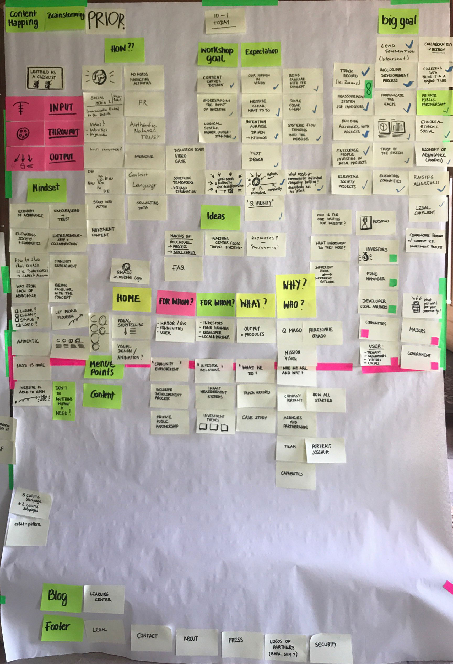
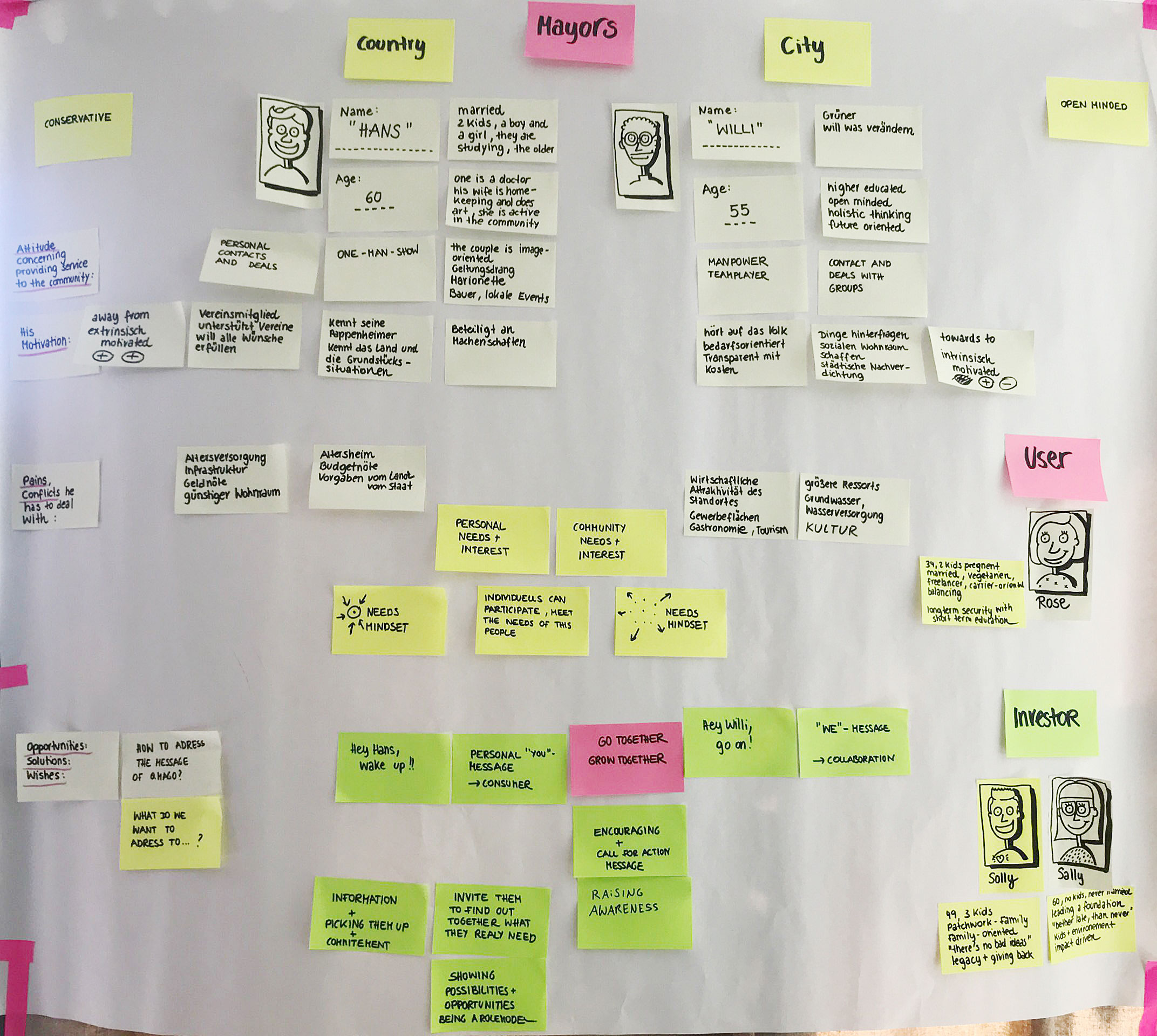
In the third workshop unit, we developed the strategy for the website together with the client and PPW Marketing, who was responsible for the web development. We defined the vision of QMAGO, how the company operates, and the target audience. The outcome included the structure, content, and design of the website.
Design of the website
